Jak ustawić parametry obracanego sześcianu w SVG

0

Witam
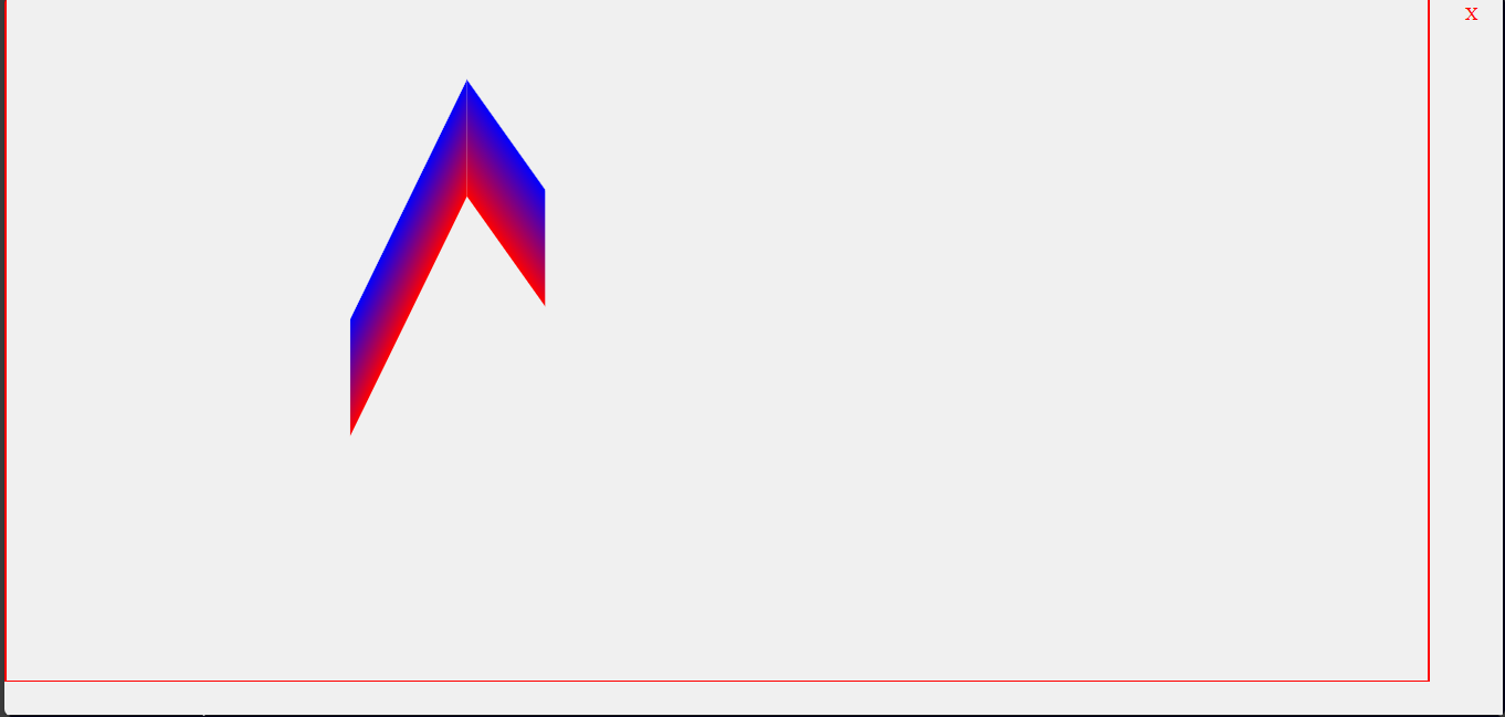
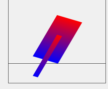
Potrzebuję utworzyć kompletną figurę, żeby bokami się stykały kwadraty żeby się obracały jak sześcian.
Teraz się obraca ale boki się nie stykają.
Prawy róg mniejszczego kwadratu powinien mieć koniec na lewym rogu dużego.
Co tu zmienić?

screenshot-20240324165755.png

<!DOCTYPE html>
<html lang="en">
<head>
<meta charset="UTF-8">
<meta name="viewport" content="width=device-width, initial-scale=1.0">
<title>SVG 3D Rotation</title>
<style>
  body, html {
    height: 100%;
    margin: 0;
    display: flex;
    justify-content: center;
    align-items: center;
    background-color: #f0f0f0;
  }
  svg {
    border: 1px solid #000;
  }

</style>
</head>
<body>
<svg style="position:absolute;top:0vh;"  width="400" height="400" viewBox="-200 -200 200 200" xmlns="http://www.w3.org/2000/svg">
  <defs>
    <linearGradient id="gradient" x1="0%" y1="0%" x2="0%" y2="100%">
      <stop offset="0%" style="stop-color: red;" />
      <stop offset="100%" style="stop-color: blue;" />
    </linearGradient>
  </defs>
  <rect id="myRect" width="100" height="100" fill="url(#gradient)"/>
</svg>
<svg style="position:absolute;top:10vh;" width="400" height="400" viewBox="-200 -200 200 200" xmlns="http://www.w3.org/2000/svg">
  <defs>
    <linearGradient id="gradient" x1="0%" y1="0%" x2="0%" y2="100%">
      <stop offset="0%" style="stop-color: red;" />
      <stop offset="100%" style="stop-color: blue;" />
    </linearGradient>
  </defs>
  <rect id="myRect2" width="20" height="100" fill="url(#gradient)"/>
</svg>


<script>
// Get the SVG rect element
const rect = document.getElementById('myRect');
const rect2 = document.getElementById('myRect2');
// Define rotation angles
let rotationX = 0;
let rotationY = 0;
let rotationZ = 0;

// Set interval to rotate the SVG object
setInterval(() => {
  // Increment rotation angles
  rotationX += 1;
  rotationY += 1;
  rotationZ += 1;

  // Apply 3D rotation using CSS transform property
  rect.style.transform = `translate(-50%, -50%) rotateX(${rotationX}deg) rotateY(${rotationY}deg) rotateZ(${rotationZ}deg)`;
rect2.style.transform = `translate(-50%, -50%) rotateX(${rotationX}deg) rotateY(${rotationY}deg) rotateZ(${rotationZ}deg)`;
}, 20); // Rotate every 50 milliseconds*
</script>
</body>
</html>
0

To jest lepsze ale kątu prostego nie zachowuje

screenshot-20240324205720.png

<!DOCTYPE html>
<html lang="en">
<head>
<meta charset="UTF-8">
<meta name="viewport" content="width=device-width, initial-scale=1.0">
<title>SVG 3D Rotation</title>
<style>
  body, html {
    height: 95vh;
    width:95vw;
    margin: 0;
    display: flex;
    justify-content: center;
    align-items: center;
    background-color: #f0f0f0;
    border:1px solid red;
  }
  svg {
    border: 0px solid #000;
    height: 80vh;
    width:80vw;
  }
</style>
</head>
<body>
<svg style="position:absolute;left:10vw;border:0px solid red;" width="80" height="80" viewBox="-100 -100 200 200" xmlns="http://www.w3.org/2000/svg">
  <defs>
    <linearGradient id="gradient" x1="0%" y1="0%" x2="0%" y2="100%">
      <stop offset="0%" style="stop-color: red;" />
      <stop offset="100%" style="stop-color: blue;" />
    </linearGradient>
  </defs>
  <rect id="myRect" width="50" height="100" fill="url(#gradient)"/>
</svg>
<svg style="position:absolute;left:10vw;border:0px solid red;" width="80" height="80" viewBox="-100 -100 200 200" xmlns="http://www.w3.org/2000/svg">
  <defs>
    <linearGradient id="gradient2" x1="0%" y1="0%" x2="0%" y2="100%">
      <stop offset="0%" style="stop-color: red;" />
      <stop offset="100%" style="stop-color: blue;" />
    </linearGradient>
  </defs>
  <rect id="myRect2" width="100" height="100" fill="url(#gradient2)"/>
</svg>


<script>
// Get the SVG rect elements
const rect = document.getElementById('myRect');
const rect2 = document.getElementById('myRect2');

// Define rotation angles
let rotationX = 0;
let rotationY = 0;
let rotationZ = 0;

let rotationX1 = 0;
let rotationY1 = 0;
let rotationZ1 = 0;

// Set interval to rotate the SVG objects
setInterval(() => {
  // Increment rotation angles
  rotationX += 1;
  rotationY += 0.5;
  rotationZ += 0;

  rotationX1 += 1;
  rotationY1 += 1;
  rotationZ1 += 0;

  // Apply 3D rotation using CSS transform property
  rect.style.transform = `translate(-50%, -25%) rotateX(${rotationX}deg) rotateY(${rotationY}deg) rotateZ(${rotationZ}deg)`;
  rect2.style.transform = `translate(-50%, -25%) rotateX(${rotationX1}deg) rotateY(${rotationY1}deg) rotateZ(${rotationZ1}deg)`;
}, 20); // Rotate every 20 milliseconds
</script>
</body>
</html>
0

Zainteresuj się macierzą obrotu z grafiki 3D.
Każdy punkt figury przemnażasz przez macierz obrotu.
Tu masz przykład: https://www.obliczeniowo.com.pl/258
image

0
jawlo napisał(a):

Zainteresuj się macierzą obrotu z grafiki 3D.
Każdy punkt figury przemnażasz przez macierz obrotu.
Tu masz przykład: https://www.obliczeniowo.com.pl/258

Tablica trójwymiarowa. Trochę pamięci zajmie i każdy punkt będzie potrzebował przejść przez ifa - obciążające procesor mocno.

0

Ciężko było proszę Państwa ale jakoś dałem radę, teraz edytor do tworzenia obiektów 3d i ustawienia różnych osi

Osie zbędne screenshot-20240401173616.png

1 użytkowników online, w tym zalogowanych: 0, gości: 1