Zawijanie tekstu w flip boxie CSS

0

Cześć,

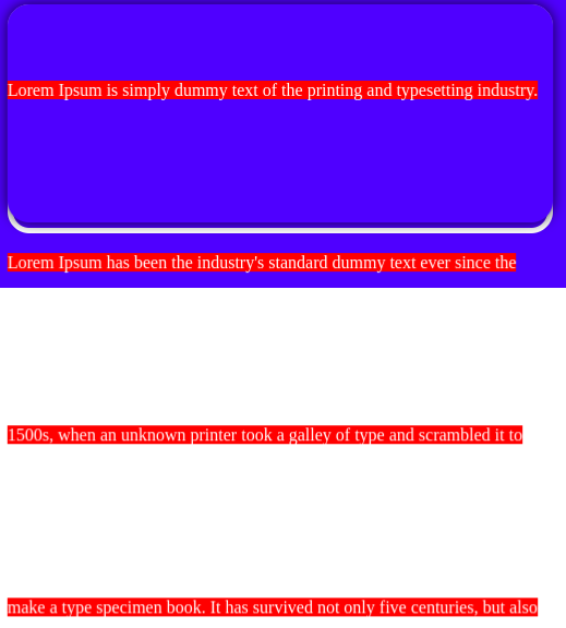
Mam problem, a mianowicie stworzyłem flipboxy z tekstem, jednak tekst na odwrocie jest ucięty.
Próbowałem z overflow i word-wrap, ale niestety nie przyniosło to żadnego efektu


.box-flip {
    height: 390px;
    border-radius: 20px;
    display: inline-block;
  }
  
  .box-flip .front {
    line-height: 200px;
    width: auto;
    text-align: center;
    font-size: 40px;
    font-family: 'day';
    color: #fff;
    border: 5px solid;
    border-radius: 20px;
    letter-spacing: 5px;
    background-image: url("...");
  
  }
  
  .box-flip .item {
    margin-left: 50px;
    margin-top: 130px;
    border-radius: 10px;
    float: left;
    cursor: pointer;
    border-radius: 20px;
  }
  
  .box-flip .item .row-item {
    -webkit-transform-style: preserve-3d;
    -moz-transform-style: preserve-3d;
    -o-transform-style: preserve-3d;
    -ms-transform-style: preserve-3d;
    transform-style: preserve-3d;
    -webkit-transition: 0.6s -webkit-transform;
    -moz-transition: 0.6s -moz-transform;
    -o-transition: 0.6s -o-transform;
    -ms-transition: 0.6s -o-transform;
    transition: 0.6s transform;
    position: relative;
  }
  
  .box-flip .item:hover .row-item {
    -webkit-transform: rotateY(.5turn);
    -moz-transform: rotateY(.5turn);
    -o-transform: rotateY(.5turn);
    -ms-transform: rotateY(.5turn);
    transform: rotateY(.5turn);
  }
  
  .box-flip .item .row-item>.back {
    overflow: hidden;
    opacity: 0;
    -webkit-transform: scale(0.4) rotateY(0.5turn) translateZ(1px);
    -moz-transform: scale(0.4) rotateY(0.5turn) translateZ(1px);
    -o-transform: scale(0.4) rotateY(0.5turn) translateZ(1px);
    -ms-transform: scale(0.4) rotateY(0.5turn) translateZ(1px);
    transform: scale(0.4) rotateY(0.5turn) translateZ(1px);
    -webkit-transition: 0.4s .075s opacity, 0.2s -webkit-transform;
    -moz-transition: 0.4s .075s opacity, 0.2s -moz-transform;
    -o-transition: 0.4s .075s opacity, 0.2s -o-transform;
    -ms-transition: 0.4s .075s opacity, 0.2s -ms-transform;
    transition: 0.4s .075s opacity, 0.2s transform;
    display: block;
  }
  
  .box-flip .item .row-item>.back {
    display: none\9;
  }
  
  .box-flip .item:hover .row-item>.back {
    overflow: visible;
    opacity: 1;
    -webkit-transform: scale(1) rotateY(0.5turn) translateZ(1px);
    -moz-transform: scale(1) rotateY(0.5turn) translateZ(1px);
    -o-transform: scale(1) rotateY(0.5turn) translateZ(1px);
    -ms-transform: scale(1) rotateY(0.5turn) translateZ(1px);
    transform: scale(1) rotateY(0.5turn) translateZ(1px);
  }
  
  .box-flip .item:hover .row-item>.back {
    display: block\9;
  }
  
  .box-flip .item {
    -webkit-perspective: 1200px;
    -moz-perspective: 1200px;
    -o-perspective: 1200px;
    -ms-perspective: 1200px;
    perspective: 1200px;
    overflow: visible;
  }
  
  .box-flip div.back {
    word-wrap: normal;
    position: absolute;
    justify-content: center;
    text-align: center;
    left: 0;
    top: 0;
    -moz-box-sizing: border-box;
    -webkit-box-sizing: border-box;
    box-sizing: border-box;
    background-image: url("...");
    z-index: 2;
    box-shadow: 0 0 12px rgba(0, 0, 0, 0.8);
    line-height: 200px;
    width: 500px;
    color: #fff;
  }
0

Fajnie byłoby jakbyś podał jeszcze kod html do tego przykładu :P

Szatansky napisał(a):
  .box-flip .item .row-item {
    -webkit-transform-style: preserve-3d;
    -moz-transform-style: preserve-3d;
    -o-transform-style: preserve-3d;
    -ms-transform-style: preserve-3d;
    transform-style: preserve-3d;
    -webkit-transition: 0.6s -webkit-transform;
    -moz-transition: 0.6s -moz-transform;
    -o-transition: 0.6s -o-transform;
    -ms-transition: 0.6s -o-transform;
  }
  
  .box-flip .item:hover .row-item {
    -webkit-transform: rotateY(.5turn);
    -moz-transform: rotateY(.5turn);
    -o-transform: rotateY(.5turn);
    -ms-transform: rotateY(.5turn);
    transform: rotateY(.5turn);
  }
  
  .box-flip .item .row-item>.back {
    -webkit-transform: scale(0.4) rotateY(0.5turn) translateZ(1px);
    -moz-transform: scale(0.4) rotateY(0.5turn) translateZ(1px);
    -o-transform: scale(0.4) rotateY(0.5turn) translateZ(1px);
    -ms-transform: scale(0.4) rotateY(0.5turn) translateZ(1px);
    transform: scale(0.4) rotateY(0.5turn) translateZ(1px);
    -webkit-transition: 0.4s .075s opacity, 0.2s -webkit-transform;
    -moz-transition: 0.4s .075s opacity, 0.2s -moz-transform;
    -o-transition: 0.4s .075s opacity, 0.2s -o-transform;
    -ms-transition: 0.4s .075s opacity, 0.2s -ms-transform;
    transition: 0.4s .075s opacity, 0.2s transform;
  }
  
  .box-flip .item:hover .row-item>.back {
    -webkit-transform: scale(1) rotateY(0.5turn) translateZ(1px);
    -moz-transform: scale(1) rotateY(0.5turn) translateZ(1px);
    -o-transform: scale(1) rotateY(0.5turn) translateZ(1px);
    -ms-transform: scale(1) rotateY(0.5turn) translateZ(1px);
    transform: scale(1) rotateY(0.5turn) translateZ(1px);
  }
  
  .box-flip .item {
    -webkit-perspective: 1200px;
    -moz-perspective: 1200px;
    -o-perspective: 1200px;
    -ms-perspective: 1200px;
    perspective: 1200px;
  }
  
  .box-flip div.back {
    -moz-box-sizing: border-box;
    -webkit-box-sizing: border-box;
    box-sizing: border-box;
  }

Większość tych przedrostków w nowoczesnych przeglądarkach jest niepotrzebna i można je skasować

https://caniuse.com/?search=perspective

.example {
  box-sizing: border-box;
  perspective: 1200px;
  transform: scale(1) rotateY(0.5turn) translateZ(1px);
  transform-style: preserve-3d;
  transition: transform 0.35s ease;
}
0
      <div class="item box-b">
            <div class="row-item">
              <div class="front">5S</div>
              <div class="back">
                <a>
                  5S pozwoli Ci na uporządkowanie stanowisk, stworzenie standardu pracy,a co za tym idzie skrócenie czasu wykonywania poszczególnych czynności
                </a>
                </div>
            </div>
          </div>
0

Te style muszą Ci psuć jakieś inne selektory, których tutaj nie wrzuciłeś, bo skopiowałem cały html (dodałem jedynie diva z .box-flip na samej górze), oraz css i można powiedzieć, że u mnie działa, nie ma problemu z przyciętym tekstem ¯\(ツ)

0
<section id="1">
<div class="tekst">
    <div class="box-flip">
        <div class="item box-a">
          <div class="row-item">
            <div class="front">BLA BLA</div>
            <div class="back"><a>BLA BLAS</a></div>
          </div>
        </div>
        <div class="item box-b">
            <div class="row-item">
              <div class="front">BLA BLA</div>
              <div class="back">
                <a>
                 <ul type="disc">
                  <li>BLA BLA</li>
                  <li>BLA BLA</li>
                  <li>BLA BLA</li>
                 </ul>
                </a>
                </div>
            </div>
          </div>
          <div class="item box-c">
            <div class="row-item">
              <div class="front">BLA BLA</div>
              <div class="back"><a>BLA BLAS</a></div>
            </div>
          </div>
          <div class="item box-d">
            <div class="row-item">
              <div class="front">BLA BLA</div>
              <div class="back"><a>BLA BLAS</a></div>
            </div>
          </div>
          <div class="item box-e">
            <div class="row-item">
              <div class="front">BLA BLA </div>
              <div class="back"><a>BLA BLAS</a></div>
            </div>
          </div>
          <div class="item box-f">
            <div class="row-item">
              <div class="front">BLA BLA</div>
              <div class="back"><a>BLA BLAS</a></div>
            </div>
          </div>

</div>
</div>
</section>

.tekst{
background-color: #fff;
width: 100%;
height: 900px;
}


.box-flip {
    height: 390px;
    border-radius: 20px;
    display: block;
  }
  
  .box-flip .front {
    line-height: 200px;
    width: auto;
    text-align: center;
    font-size: 40px;
    font-family: 'day';
    color: #fff;
    border: 5px solid;
    border-radius: 20px;
    letter-spacing: 5px;
    background-image: url("...");
  
  }
  
  .box-flip .item {
    margin-left: 50px;
    margin-top: 130px;
    border-radius: 10px;
    float: left;
    cursor: pointer;
    border-radius: 20px;
  }
  
  .box-flip .item .row-item {
    -webkit-transform-style: preserve-3d;
    -moz-transform-style: preserve-3d;
    -o-transform-style: preserve-3d;
    -ms-transform-style: preserve-3d;
    transform-style: preserve-3d;
    -webkit-transition: 0.6s -webkit-transform;
    -moz-transition: 0.6s -moz-transform;
    -o-transition: 0.6s -o-transform;
    -ms-transition: 0.6s -o-transform;
    transition: 0.6s transform;
    position: relative;
  }
  
  .box-flip .item:hover .row-item {
    -webkit-transform: rotateY(.5turn);
    -moz-transform: rotateY(.5turn);
    -o-transform: rotateY(.5turn);
    -ms-transform: rotateY(.5turn);
    transform: rotateY(.5turn);
  }
  
  .box-flip .item .row-item>.back {
    overflow: hidden;
    opacity: 0;
    -webkit-transform: scale(0.4) rotateY(0.5turn) translateZ(1px);
    -moz-transform: scale(0.4) rotateY(0.5turn) translateZ(1px);
    -o-transform: scale(0.4) rotateY(0.5turn) translateZ(1px);
    -ms-transform: scale(0.4) rotateY(0.5turn) translateZ(1px);
    transform: scale(0.4) rotateY(0.5turn) translateZ(1px);
    -webkit-transition: 0.4s .075s opacity, 0.2s -webkit-transform;
    -moz-transition: 0.4s .075s opacity, 0.2s -moz-transform;
    -o-transition: 0.4s .075s opacity, 0.2s -o-transform;
    -ms-transition: 0.4s .075s opacity, 0.2s -ms-transform;
    transition: 0.4s .075s opacity, 0.2s transform;
    display: block;
  }
  
  .box-flip .item .row-item>.back {
    display: block;
  }
  
  .box-flip .item:hover .row-item>.back {
    overflow: visible;
    opacity: 1;
    -webkit-transform: scale(1) rotateY(0.5turn) translateZ(1px);
    -moz-transform: scale(1) rotateY(0.5turn) translateZ(1px);
    -o-transform: scale(1) rotateY(0.5turn) translateZ(1px);
    -ms-transform: scale(1) rotateY(0.5turn) translateZ(1px);
    transform: scale(1) rotateY(0.5turn) translateZ(1px);
  }
  
  .box-flip .item:hover .row-item>.back {
    display: block;
  }
  
  .box-flip .item {
    -webkit-perspective: 1200px;
    -moz-perspective: 1200px;
    -o-perspective: 1200px;
    -ms-perspective: 1200px;
    perspective: 1200px;
    overflow: visible;
  }
  
  .box-flip div.back {
    position: absolute;
    left: 0;
    top: 0;
    -moz-box-sizing: border-box;
    -webkit-box-sizing: border-box;
    box-sizing: border-box;
    background-image: url("...");
    z-index: 2;
    box-shadow: 0 0 12px rgba(0, 0, 0, 0.8);
    line-height: 200px;
    width: 500px;
    color: #fff;
  }
  
  .box-flip .box-a {
    width: 500px;
    height: 200px;
    margin-right: 2px;
    margin-bottom: 2px;
  }
  
  .box-flip .box-a .back {
    width: 500px;
    height: 200px;
    border-radius: 20px;
   
  }

  .box-flip .box-b {
    width: 500px;
    height: 200px;
    margin-right: 2px;
    margin-bottom: 2px;
    border-radius: 20px;
  }
  
  .box-flip .box-b .back {
    width: 500px;
    height: 200px;
    border-radius: 20px;
  }

  .box-flip .box-c {
    width: 500px;
    height: 200px;
    margin-right: 2px;
    margin-bottom: 2px;
    border-radius: 20px;
  }
  
  .box-flip .box-c .back {
    width: 500px;
    height: 200px;
    border-radius: 20px;
  }

  .box-flip .box-d {
    width: 500px;
    height: 200px;
    margin-right: 2px;
    margin-bottom: 2px;
    border-radius: 20px;
  }
  
  .box-flip .box-d .back {
    width: 500px;
    height: 200px;
    border-radius: 20px;
  }

  .box-flip .box-e {
    width: 500px;
    height: 200px;
    margin-right: 2px;
    margin-bottom: 2px;
    border-radius: 20px;
  }
  
  .box-flip .box-e .back {
    width: 500px;
    height: 200px;
    border-radius: 20px;
  }

  .box-flip .box-f {
    width: 500px;
    height: 200px;
    margin-right: 2px;
    margin-bottom: 2px;
    border-radius: 20px;
  }
  
  .box-flip .box-f .back {
    width: 500px;
    height: 200px;
    border-radius: 20px;
  }

Jeżeli znajdziesz chwilę to spójrz na kod, kombinowałem ale nie mogę znaleźć tego chochlika

1

Tekst wygląda na "ucięty" przez zbyt dużą wartość line-height w tym miejscu

box-flip div.back {
  /* ... */
  line-height: 200px;
  /* ... */
}

Gdybyś ustawił sobie jakiś inne tło przy tym tekście, to przyczynę znalazłbyś w kilka minut :P (biały tekst, wyświetlał się na białym tle i dlatego nie było go widać)

screenshot-20230101213129.png

0

hahaha :D
tyle godzin szukania, a tu proszę.

Dzięki !

1 użytkowników online, w tym zalogowanych: 0, gości: 1