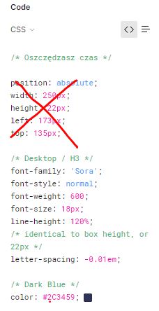
Mam zrobić zadanie w którym ma być obrazek z position absolute i left np 220px i top 100px, to ma być responsywne więc zrobiłem to w procentach, jednak mam 2 kolumny i gdy jedna znajdzie się pod drugą to jest duża przestrzeń między nimi w pionie, bo użyłem do obrazka padding-bottom by druga kolumna nie nachodziła na obrazek, jak mogę rozwiązać ten problem, oto kod:
tu link do kodu na github link i strona link
html
<!doctype html>
<html lang="en">

<head>
    <!-- Required meta tags -->
    <meta charset="utf-8">
    <meta name="viewport" content="width=device-width, initial-scale=1, shrink-to-fit=no">
    <link href="https://cdn.jsdelivr.net/npm/[email protected]/dist/css/bootstrap.min.css" rel="stylesheet"
        integrity="sha384-1BmE4kWBq78iYhFldvKuhfTAU6auU8tT94WrHftjDbrCEXSU1oBoqyl2QvZ6jIW3" crossorigin="anonymous">
    <link rel="stylesheet" href="src/scss/main.css">

    <title>Krystian</title>
</head>

<body>
    <div class="container position-relative">

        <div class="row">
            <div class="col img">
                <div class="imgimg position-relative">
                <img class='position-absolute' alt="beach"
                width='505' height="330"
                    src="images/grandmotel.png">
                </div>
            </div>
            <div class="col text">
                <div>
                    <h1>infrastructures and</h1>

                    <p>
                        Lorem Ipsum is simply dummy text of the printing and typesetting industry. Lorem Ipsum has been the industry's standard dummy text ever since the 1500s, when
                    </p>
                    <button>Button</button>
                </div>

            </div>
        </div>
    </div>
    <script src="src/js/main.js"></script>
    <script src="https://cdn.jsdelivr.net/npm/[email protected]/dist/js/bootstrap.bundle.min.js"
        integrity="sha384-ka7Sk0Gln4gmtz2MlQnikT1wXgYsOg+OMhuP+IlRH9sENBO0LRn5q+8nbTov4+1p" crossorigin="anonymous">
    </script>

</body>
css
* {
  font-family: Roboto;
}

.container {
  max-width: 1440px;
  max-height: 990px;
  padding: 0;
}

.container .row {
  margin: auto;
}

.container .row .img {
  padding: 0;
}

.container .row .img .imgimg {
  height: 0;
  padding-bottom: 65.34%;
}

.container .row .img .imgimg img {
  max-width: 505px;
  max-height: 330px;
  width: 90%;
  height: 90%;
  left: 39.5%;
  top: 13.5%;
}

.container .row .text {
  padding: 9.5%;
}

.container .row .text div {
  width: 380px;
  margin: auto;
}

.container .row .text div h1 {
  height: 50px;
  font-size: 42px;
  line-height: 50.4px;
  color: #121212;
  width: 380px;
}

.container .row .text div h1,
.container .row .text div button {
  font-weight: 700;
}

@media screen and (max-width: 1260px) {
  .row {
    flex-direction: column;
  }
}

@media screen and (max-width: 960px) {
  img {
    left: 20%;
  }
}

@media screen and (max-width: 720px) {
  img {
    left: 10%;
    padding-right: 10px;
  }
}