Mam do zrobienia psd z załącznika, jak zrobić by główny blok o szer 1172 px był na środku jeśli szerokość strony jest większy niż 1172px a przy tym by na bokach były kolory jak na psd?
0
0
BODY {
  background-color:green;
}

#glowny_blok {
  max-width:1172px;
  margin:auto;
}
0
mam taki kod main.scss i mi nie dziala
* {
    box-sizing: border-box;
  }

    nav {
        max-width: 1172px;
        padding: 0;
        height: 85px;
        color: #ffffff;
        margin: auto;

        .logo {
            margin: 23px 0;
        }
    }

    .first-section {
        height: 466px;
        background-color: #215398;
        .heading {
            margin-top: 60px;
            height: 52px;
            color: #ffffff;
        }
        .heading-two {
            height: 65px;
            color: #5f83b5;
            margin-top: 0;
        }
        .divs {
            height: 228px;
        }
    }
a to html
<!DOCTYPE html>
<html lang="en">

<head>
    <meta charset="UTF-8">
    <meta name="viewport" content="width=device-width, initial-scale=1.0">
    <link href="https://cdn.jsdelivr.net/npm/[email protected]/dist/css/bootstrap.min.css" rel="stylesheet"
        integrity="sha384-giJF6kkoqNQ00vy+HMDP7azOuL0xtbfIcaT9wjKHr8RbDVddVHyTfAAsrekwKmP1" crossorigin="anonymous">
    <link rel="stylesheet" href="main.css">
    <title>Document</title>
</head>

<body>
    <div class="container"></div>
    <div class="row">
        <nav>
            <img src="img/logo.jpg" class="logo" alt=""></a>
        </nav>
    </div>
    <div class="row first-section">
        <h1 class="heading text-center">Heading</h1>
        <h2 class="heading-two text-center">Lorem ipsum dolor sit amet, consectetur adipiscing elit</h2>

        <div class="col-sm divs">
            One of three columns
        </div>
        <div class="col-sm divs">
            One of three columns
        </div>
        <div class="col-sm divs">
            One of three columns
        </div>

    </div>
    <div class="row">

    </div>
    </div>
    <script src="https://cdn.jsdelivr.net/npm/[email protected]/dist/js/bootstrap.bundle.min.js"
        integrity="sha384-ygbV9kiqUc6oa4msXn9868pTtWMgiQaeYH7/t7LECLbyPA2x65Kgf80OJFdroafW" crossorigin="anonymous">
    </script>
</body>

</html>
0
poprawiłem jednak pojawia mi się padding 12px w nav i cała reszta strony ma szerokość 1172px a nie tylko nav.
kod html
<!DOCTYPE html>
<html lang="en">

<head>
    <meta charset="UTF-8">
    <meta name="viewport" content="width=device-width, initial-scale=1.0">
    <link href="https://cdn.jsdelivr.net/npm/[email protected]/dist/css/bootstrap.min.css" rel="stylesheet"
        integrity="sha384-giJF6kkoqNQ00vy+HMDP7azOuL0xtbfIcaT9wjKHr8RbDVddVHyTfAAsrekwKmP1" crossorigin="anonymous">
    <link rel="stylesheet" href="main.css">
    <title>Document</title>
</head>

<body>
    <div class="container">
        <div class="row">
            <nav>
                <img src="img/logo.jpg" class="logo" alt=""></a>
            </nav>
        </div>
        <div class="row first-section">
            <h1 class="heading text-center">Heading</h1>
            <h5 class="heading-two text-center">Lorem ipsum dolor sit amet, consectetur adipiscing elit</h5>
            <div>
                <div class="col-sm divs">
                    One of three columns
                </div>
                <div class="col-sm divs">
                    One of three columns
                </div>
                <div class="col-sm divs">
                    One of three columns
                </div>
            </div>
        </div>
        <div class="row">

        </div>
    </div>
    <script src="https://cdn.jsdelivr.net/npm/[email protected]/dist/js/bootstrap.bundle.min.js"
        integrity="sha384-ygbV9kiqUc6oa4msXn9868pTtWMgiQaeYH7/t7LECLbyPA2x65Kgf80OJFdroafW" crossorigin="anonymous">
    </script>
</body>

</html>
css
* {
    box-sizing: border-box;
  }

    nav {
        padding: 0;
        max-width: 1172px;
        height: 85px;
        color: #ffffff;
        margin: auto;

        .logo {
            margin: 23px 0;
        }
    }

    .first-section {
        height: 466px;
        background-color: #215398;
        padding-bottom: 60px;
        .heading {
            margin-top: 60px;
            height: 52px;
            color: #ffffff;
            font-family: 'arial regular';
        }
        .heading-two {
            height: 65px;
            color: #5f83b5;
            margin-top: 0;
            font-family: 'arial regular';
        }
        .divs {
            height: 228px;
            max-width: 330px;
            padding: 0;
            margin: 0 8.5px;
        }
    }
0
W takim razie co ma być wyśrodkowane? Całość czy tylko nav?
Jeśli całość, to wszystko możesz wpakować do diva z klasą .container
czyli
HTML:
<body>
   <div class="container">
       <div class="row">
         <nav></nav>
       </div>
       <div class="row">
         <!-- inne elementy -->
       </div>
   </div>
</body>
CSS
.container{
   max-width: 1172px;
   margin: 0 auto;
}
Jeśli tylko nav, to możesz to zrobić np tak:
HTML:
<body>
   <div class="container">
       <div class="row">
         <nav></nav>
       </div>
   </div>
   <div class="some_class">
      <!-- inne elementy -->
    </div>
</body>
CSS
.container{
   max-width: 1172px;
   margin: 0 auto;
}
A te marginy to albo są predefiniowane przez przeglądarkę, albo narzuca je bootstrap
Zawsze warto dorzucić jakiś reset styli dla przeglądarek.
0
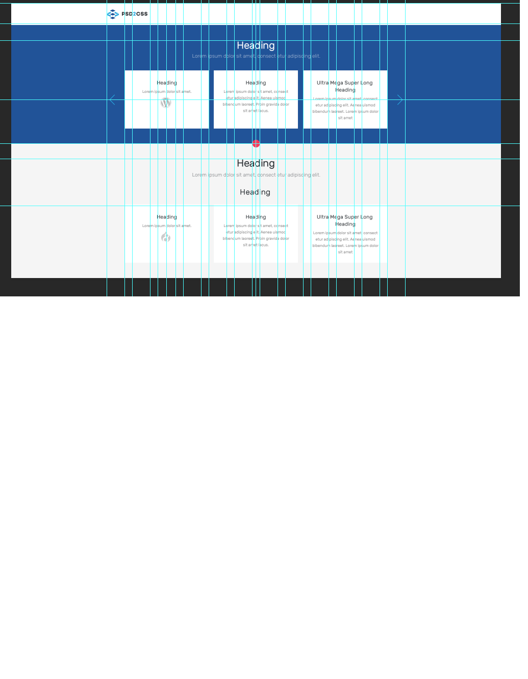
Najlepiej wrzuć jakąś grafikę pokazującą, jak ma to wyglądać.
0
0
Potrzebujesz na ten nagłówek dwóch elementów:
<div id="naglowek_zewnetrzny">
  <div id="naglowek_wewnetrzny">
    ...
  </div>
</div>
#naglowek_zewnetrzny {
  widht:100%;
  background-color:#215398;
}

#naglowek_wewnetrzny {
  widht:100%;
  max-width: 1172px;
  margin: auto;
  height:123px;
}
BODY też musi mieć 100% szerokość, nie wrzucaj tego nagłówka w żadne dodatkowe kontenery.
0
nie rozumiem, chodzi mi o to, że ta część z logiem by była na 1172px i w środku jak na obrazku, reszta też w środku, ale tam kolory są po bokach, i w moim kodzie jak ustawiam nav na 1172 to mam całą stronę na taką szerokość
0
Napisałam ci jak zrobić nagłówek o maksymalnej szerokości i z marginesami na całą szerokość.
Resztę strony sobie ustawiasz wo osobnym DIV i dajesz mu takie max-widt, jakie sobie życzysz.